I tried to view the page on iOS and it was definitely unfamiliar.
Even on desktop I imagine it would feel more like a presenter view in PowerPoint than a blog post. Unless it somehow looks radically different to on desktop than what this mobile view looks like.
I usually have all windows maximized so normally this is not a problem for me but I've noticed other people, (especially mac people), don't like to maximize their windows. Here is one screenshot to show an example on Windows where I have a 4k display with two browser windows side by side each window at 50% so texton the image is unreadable.
I have to say the image associated with the text "With the power of shadcn/ui and Tailwind CSS, we can generate high-quality, aesthetically pleasing UI code." made me laugh, because it not only doesn't look particularly good to me (but that's personal style as much as anything) but seems to be one of those layouts that results in an optical illusion. I keep seeing gray circles at the intersections of the gaps between rows and columns that aren't actually there.
Looks interesting as a proof of concept, I'm curious about the quality of the code it generates.
Does it work? With all respect to the author - kudos for interesting product - but does it really work in real life? Since I don't have any project in React/Svelte/Vue (ng programmer :( ) at hand - I would really hope someone would share the experience. Looks like something I've been waiting for some time now...
I am not the author but absolutely huge kudos. I’m building something similar called Magic Patterns. Considering you asked to try it in real life, you can try on our website directly: https://www.magicpatterns.com/
We do a similar approach, i.e., parse the AST to reconstruct the imports and remove hallucinations. It's quite the technical challenge: feeding non-deterministic generated code into functions to clean up all the hallunications. But it works. You can see examples of developers using our generated React code below.
very exciting to see people building in this space.
This looks cool but as a bit of feedback I assumed your pricing would be way out of my league because you have a free trial and a "contact us" as the only public pricing I could see. After logging in I saw the next step up was just $8/mo!
Cool beans ! love this. I am wondering how hard it is to introduce new design system ? I am particularly interested in Lighting design system >> https://www.lightningdesignsystem.com/
hey thanks! Not hard, we add custom design systems all the time for our customers and have plans to make it self-serve. I've never scheduled this through hackernews before haha: would to hear more about your use case and hook it up for if you're open for a call? early days for us. my email is alex[at]magicpatterns.com
I mean it's not like you can name your company Microsoftcom so I'm not sure these are any better. If someone owns vx.dev and they bought it before this thing was published they don't have to try very hard to make a case for infringement.
Why do these AI products keep telling on themselves for producing broken results in their marketing copy?
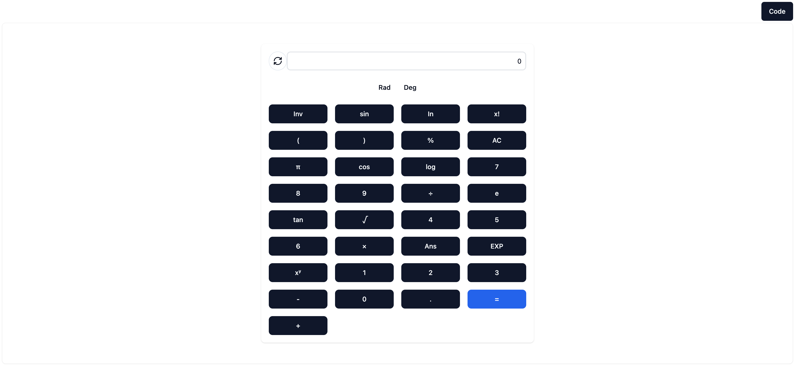
This screenshot of the generated calculator is rubbish https://pub-92e90cabe8b8410dbb5e46d17a83dce2.r2.dev/vx-websi.... This does not match the "high-quality, aesthetically pleasing UI" it boasts in the caption. What's with the ordering of all the buttons? Why is this the examble they chose to screenshot and advertise with?