Lowest screen brightness and color correctness of the said screen are not trivial issues. I used to work in a dimly illuminated room during late nights, and any screen which can't do low-light properly is blinding.
Color correctness, even if you don't hit "calibrated pipeline" levels is extremely useful for seeing and/or editing photos. Even if you're doing this casually.
If I'm buying a premium machine, I don't expect and want to mod it with $3 tape and ¢50 markers. It's like buying a premium car and installing an aftermarket instrument cluster because the OEM one is too bright at its lowest setting.
I agree, but reality is often different, even for cars. Sometimes because of incompetence, sometimes because of dark patterns. Many newer cars do have space for putting your phone somewhere on the middle console, but it's arranged in ways to make it impossible to place your phone in a way that would make it usable for navigation. Why? Because they desparately want you to use their own navigation setup (which probably costs extra too).
Every software development organisation I've been in that used Mattermost built integrations with monitoring, build pipelines, LDAP queries and the like.
I'm sure organisations in war would do similar things, but with the tools of their 'craft'.
    - No limitation on search, members, etc.
    - 10 user limit for mobile notifications, can be relaxed via community (for non-profits, FOSS projects, etc.)
    - SAML/LDAP *support* is available, you can configure it. They won't provide answers to your questions.
    - Actually, all Zulip features are enabled sans Mobile Notifications, but for most of them, you're on your own. If you know what you're doing, it's not a problem, I assume.
IOW, for self-hosted plans, you pay for support, not the software. a-la early RedHat model.
Moreover, Transmeta did this for their actual processor back in the day. Transmeta's version even did it in multipass, fusing more and more instructions as they appear more, getting faster as the system is used more, up to a certain point of course.
This doesn't make Fabrice a lesser man, but truth is truth.
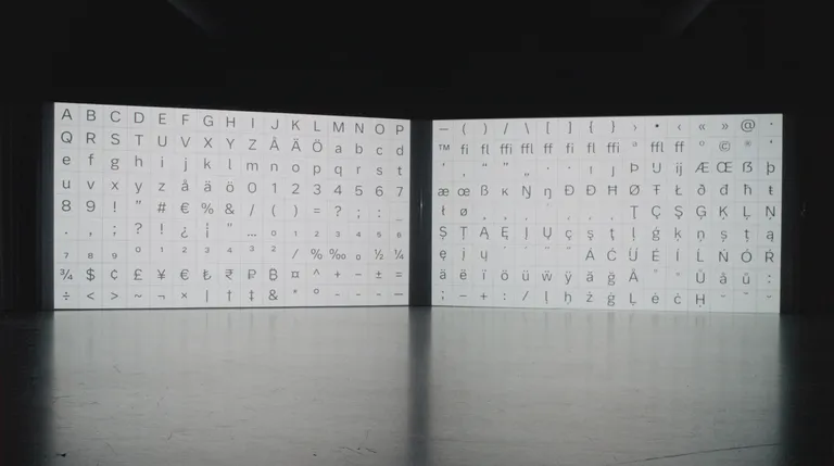
The font is proportioned very cleanly. Every lower case letter has the same height, and if they need to be higher like an "h", the remaining part of the font except the long stem is again the same height. This creates two well defined lines where the text is present. With the wide stance of the font, plus all the lowercase and uppercase characters occupy almost the same area, text fits into a loose grid.
It's a modern, almost mono, minimalist font which reduces the effort required to process it. With some tasteful design choices, it doesn't look bland, either. It's like a well-crafted machine draped in a beautiful paneling. It's as engineering as it gets, but in typography.
For anyone who thinks legibility in typographic design is a minor issue, please read about highway sign design, Saab's "Night Panel", Germany's license plate font (which is a fruit of another legibility problem), Atkinson HyperLegible fonts, and aircraft dial design studies done in the past.
This is important work and is being outsourced (so no heavy load on Volvo employees besides reviewing the work), and I believe this is as important as reducing any distractions during driving.
Ford used to have (and may still have) a cockpit/dashboard simulator where they install prototype dashboards and test their mental load by creating "unexpected hazards" in the simulation while tweaking something on the dash.
I can operate my car's controls without even looking at them and just by feeling them, while looking at the road. The dials are extremely readable, so I'm not aware that I'm checking them even. We should be targeting this over design, any day.
And what would you say is more conductive to safety -- having to use the giant tablet and READ it to use the temperature/volume controls, or having a physical, tactile buttons and knobs that can be found and operated without ever taking the eyes off the road?
If you say that making a font easier to read increases the safety more I think NCAP would like a word.
> If you say that making a font easier to read increases the safety more I think NCAP would like a word.
Yes, I say that. However, what I don't say is that we shall increase touch controls. I support more physical controls, but physical controls doesn't invalidate displays or the need for text.
See, reducing cognitive load is the aim. If I can read a road sign faster, or understand what my instrument cluster is saying in shorter time, both are equally significant wins. LCD instrument clusters are not going anywhere, and they come in variety of sizes and qualities. A boring, quickly readable cluster is always better than an exciting, but an unreadable one, so design and font choice is a factor.
Below, I noted the instrument cluster of Ford Puma Hybrid. Utterly boring, extremely easy to understand and packed with more information than most cars I have driven. It's a great experience, and font selection is at least 30% of that.
So yes, a good font is a security multiplier, and if it can look good while staying very legible, this is a great win.
I asked if in your opinion clarity of the font on the CONSOLE, inside the car, is more conductive to the safety than being able to operate critical / common functions without looking (ie: without having to read the text).
DON'T ADD the road signs to the context, Volvo is not updating road signs. This is moving the goalpost/strawman.
First is a current situation in this car to change the temperature:
1. Having to look at the screen, read, find, reach to touch, read, find, touch
versus the situation with physical controls:
2. Reach without looking, press/turn
And you really say "having to look, read, find, reach to touch, read, find, touch" is better than just reaching without looking? Because this is what you say: making a font on the infotainment easier to read improves the safety more than adding physical controls.
i ask because i had a SAAB 900 model from the early 80s, used, and it was like that. never needed to look away from the road...and it's been gone for 35 years now but oh how i miss its design.
It's not something very young. An 2001 Ford Focus MK-I. However, I recently drove a Ford Puma Hybrid, and that had the same DNA. Great dashboard despite being LCD, good controls, on-wheel cruise and limiter, etc. I can do most of the things without looking away from the road.
While I use Apple CarPlay most of the time, it's navigation was good, even. With good directions and readable, clear maps.
For all the cars I have rented in the last 2-3 years, Ford still has that DNA the best.
That makes only the lowercase L unambiguous, not the uppercase I )). But at that point, for a font intended for text with context, it is surely nitpicking on my part.
My ideal font is a san serif, in which the uppercase I had a small hint of serifs. I live in a fantasy world though, along with my Debian desktop and electric car.
For the intended context, the font is both elegant and unambiguous enough, so I have no qualms with that.
I also tend to like sans serif fonts, and my personal favorite is Inter these days. On the other hand, anything technical (terminal, programming, diagrams, etc.) gets Berkeley Mono as the only choice. Sometimes diagrams and labels get DIN though, if I feel fancy that day.
I also live in a fantasy world which I spoil myself with a Debian desktop, but an ideal car for me is a hybrid one, which I'm going to get in a near-ish future.
Yes! I use it in all my systems' terminals and it's really a great font. Also it's a great homage to the fonts I used back in the day and the era that I missed.
reply